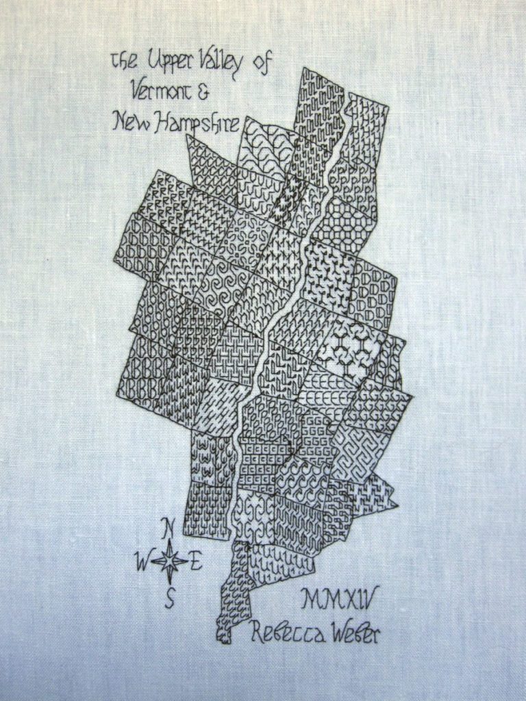
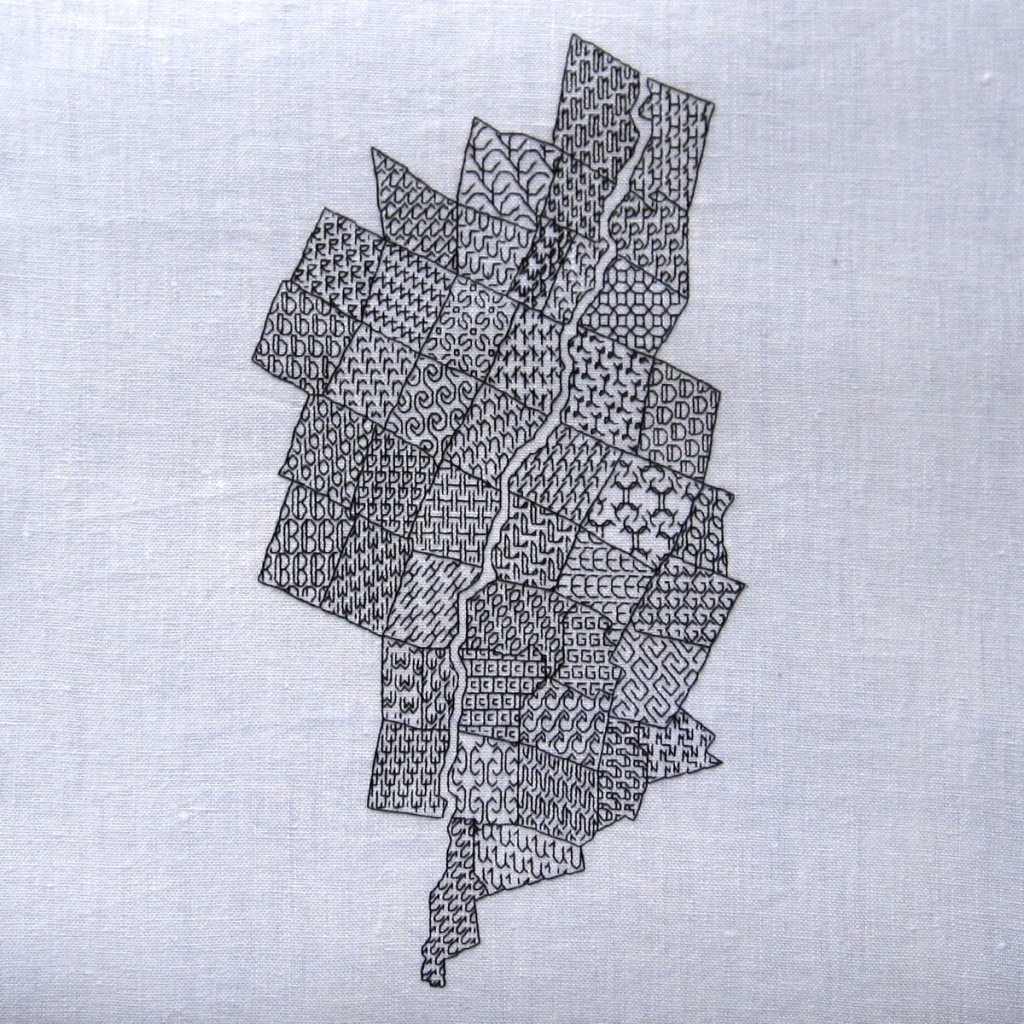
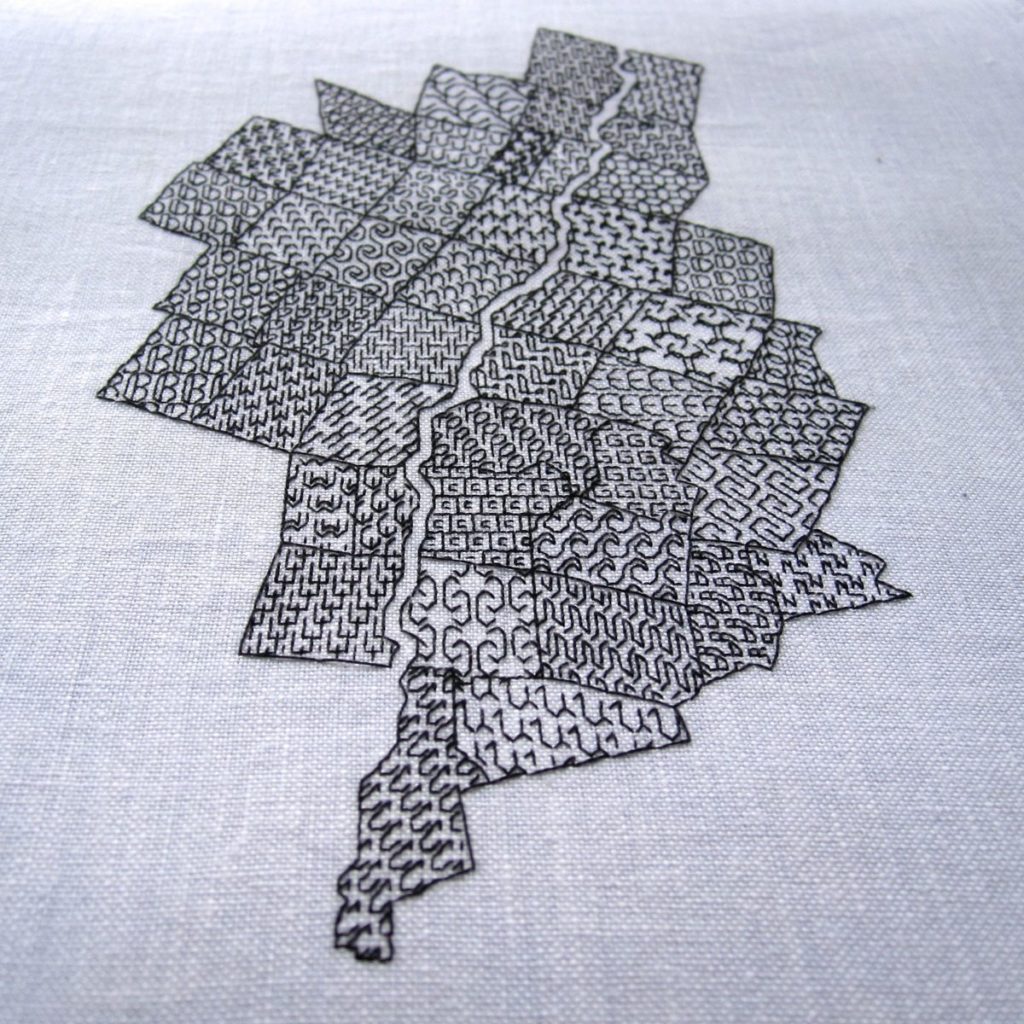
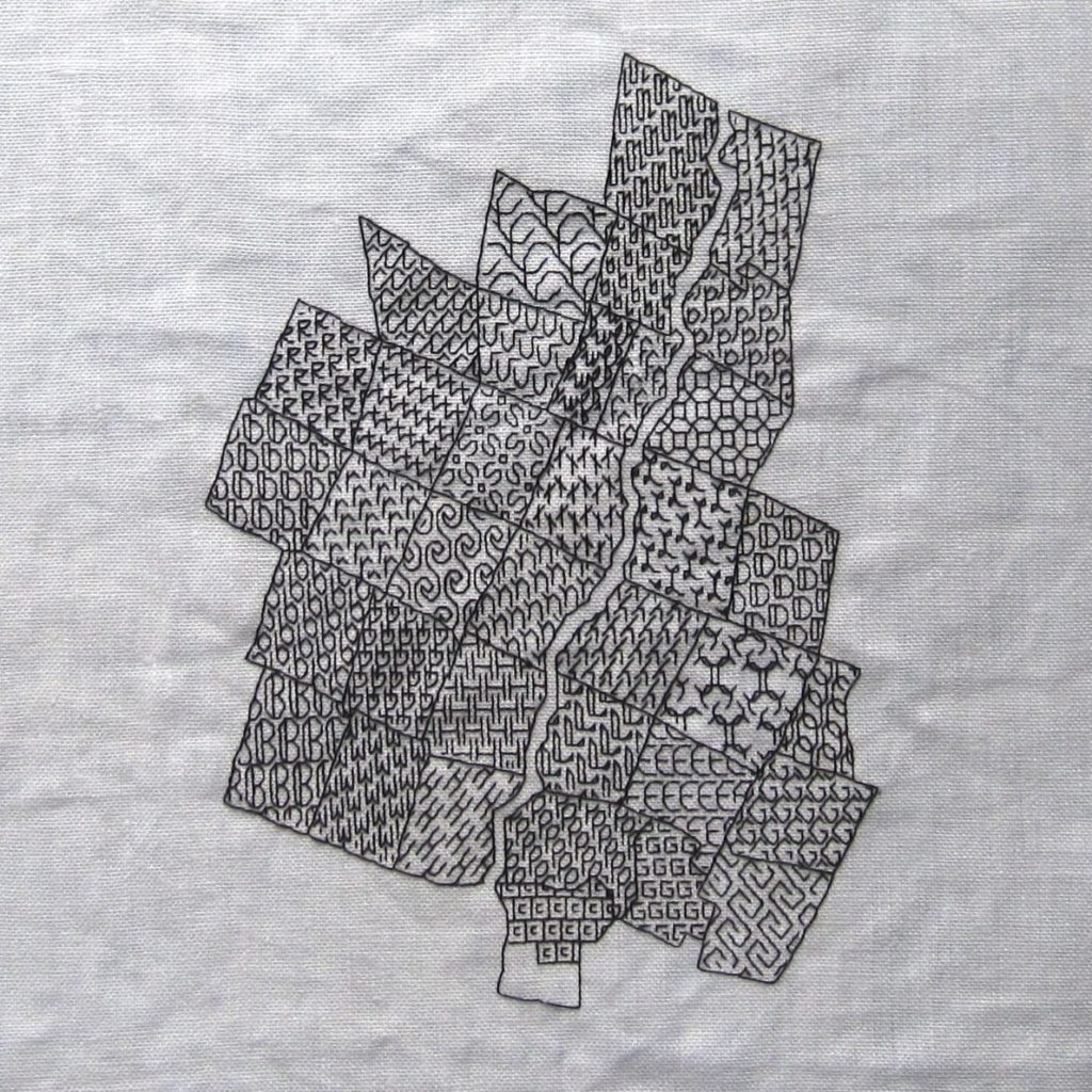
Remember the blackwork map of my local area that I spent so much time designing and stitching last year? I’ve added to it.
Title, compass rose, and attribution. Since I did the vast majority of the work last year I used that date. And since I am me, I designed the alphabet myself, all the letters in upper- and lowercase, and digits although I ultimately liked the look of the Roman numerals better.
Since blackwork was popular over a long stretch of time I had a lot of options for an era-appropriate script. I found a website called Medieval Writing with lots of examples of scripts and was able to observe my lowercase options pretty thoroughly. I decided to create a blend of 15th-16th century English chancery hand and 15th-16th century French and Italian humanistic minuscule, with an eye to legibility for modern readers. Well, it turned out more to be based on those scripts in the way that TV movies are based on true stories, but I think it has the right flavor. I made the uppercase and numbers by looking at assorted typefaces and online calligraphy lessons, and the ampersand right out of my head. My favorites are the old-looking a, dramatic d, and potbellied U.
I have for you a blackwork alphabet PDF that includes the laid-out text for the map (aside from my name, which I didn’t think would be of much use). I thought it would be useful as an example of kerning the letters even if you wanted to use this for a different project.
After stitching, I washed the map and hung it from a deck chair out back, before I remembered I needed to block it on the ironing board with six or seven hundred pins. Next stop: the frame shop. I’ve never had any of my embroidery framed, so this will be an adventure.
