Black & tan

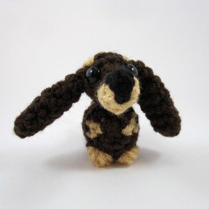
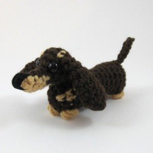
The little dachshund from amigurumi class wanted a bit more prettying before going out into the world. Specifically, he wanted a black and tan color scheme.

black & tan nose-on black & tan semi-profile
Dachshund pattern

The instructions should make it easy to do this color scheme or a monochromatic dog.

My brother and his family have a black and tan dachshund who is bestest friends with their cat. The got the cat in mid-December and the dog in early January, and they play together, nap together, and get into trouble together. This dachshund is in honor of them, and if I decide the world doesn’t have enough amigurumi cats after all, maybe I’ll add a cat to the mix too.

This ami has a companion document as well, a four-page pdf that attempts to distill all the necessary information for making amigurumi (beyond the basic crochet stitches) into one easily printed location. Here’s the table of contents.

  1. Making and tightening the double magic ring; color changing both generally and in a magic ring.
  2. Using stitch markers; working in confined spaces and around stuffing; making and comparison of different single crochet decrease techniques.
  3. Spirals versus joined rounds; closing the end of a piece and hiding the yarn; pinning completed crochet pieces together.
  4. Embroidering on crochet; making the French knot and bullion knot; securing and hiding contrasting floss or yarn; slip stitching a new piece of yarn on to add a small feature.

All of this information is available freely online, but I wanted to put it together in one concise document for reference purposes. It is sold separately and is usable without the dachshund, but the example photos are all of the dachshund.

Repurposed denim

The Sew-Op got involved with a local art gallery, AVA, as part of their 40th anniversary year. They are located in a former denim overall factory, and wanted denim to be part of their activities for the year. They were very interested in straddling that blurry line between art and craft, using denim for purely decorative endeavors, useful items that are attractive but not decorative per se, and everything in between. We discussed the limitations of the medium (we have no industrial sewing machines, so there is a bound on how many layers of denim can be sewn in the Sew-Op) and some possibilities. As part of this meeting a few Sew-Operators, myself included, volunteered to make some sample denim items for the kick-off repurposing session. That was this past Saturday. Let me show you what I did!
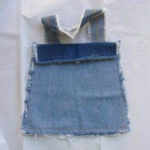
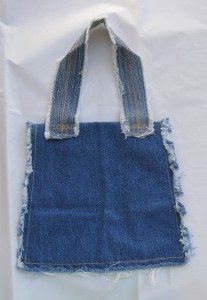
denim bag front denim bag back

This simple bag was actually whipped up for the organizational meeting. It’s two pieces of leg trimmed to equal size and sewn flat against each other, left open at the top and a little way down each side, after a strap had been sewn to one of them and the part of each that would be left open had been stitched across. I made a straight stitch about a half inch in from the edge so it could fray, and the strap has two slightly offset lines of zigzag stitch down the center. It’s all done in the thread color I refer to as “jeans gold.” After washing it I trimmed the sides, combed the bottom and gave it a little haircut as well.
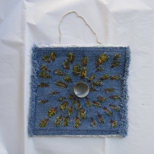
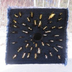
sunburst front sunburst backlit

This wall hanging was primarily to demonstrate the hanging method, dowel with string wrapped around it and hot-glued in place. I stitched around with a narrow zigzag about 5/8″ in from the edge, cut the fabric with a utility knife, washed it, and colored the slits with Crayola fabric markers. After stitching the button on I cut dowels to size and sanded their ends, and ran hot glue along the dowel against the fabric. If I had a higher temperature glue gun I may have been able to run the glue on the fabric and stick the dowel on afterward, but with low-temp the beginning of the line had solidified by the time I got to the end.
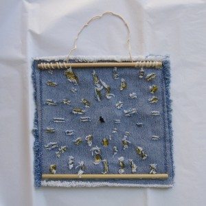
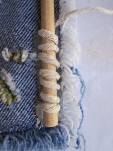
sunburst back dowel and string

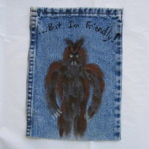
painted monster

This guy was whipped up quickly with acrylic paint and those cheap plastic-bristled kids’ paint brushes. I used brown, copper, black, pearl, and glow in the dark. I couldn’t get a good picture, but the eyes, teeth, and claws glow.
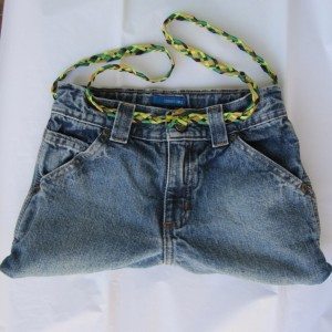
jeans bag front jeans bag back

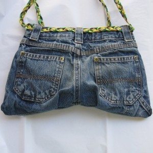
The most admired item, however, was this bag made from the top of a pair of jeans. I cut off the legs, undid the inseam, and sewed a seam across. Since the back of jeans is wider than the front, I added a pleat just inside each back pocket to accommodate that. I had originally placed the side seams to minimize the width difference (the outseam is the topstitched one, so you have to fold on one or the other side), but the jeans had additional pockets below the right back pocket so I changed that to try to minimize the number of layers I was stitching through. To line it, I cut a rectangle of fabric a bit wider than the base of the bag, folded it in half and sewed the seams adjacent to the fold. Then I folded down the top so the pocket was as deep as the base of the bag to the bottom of the waistband (as measured by eye from the outside), pressed it, and hand-stitched it to the bottom edge of the wastband inside. I also stitched the inside of the waistband shut, but you can actually access the space between the bag and lining through the fly. All the pockets still work, as well.
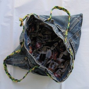
jeans bag open five-part braid

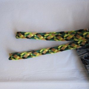
The strap was the most time-consuming of the whole operation, because I braided it out of five lengths of ribbon (using these braiding instructions). I very much like it, though, and it seems to want to stay smooth and flat. After threading it through the belt loops I tied the like-color ribbon ends together in interleaved square knots (tie half of each, then the second half of each, so some of them are entangled), trimmed them, and glued them with Fray-Chek.

I also brought along my denim coaster from the craft countdown. I had one more idea for a bag but not enough time to complete it… perhaps in the future.
First Friday

Back despite a lack of popular demand! As you may recall, First Friday was a place where I wrote about something other than a project I was doing; links around the web and craft inspiration show up, as well as sneak peeks at my work. This month I want to talk about fonts and crafting.

There are an almost ridiculous number of free fonts available. Dingbat fonts seem to have limited practical use, but if you stop thinking of them as fonts and start thinking of them as clipart you can scale cleanly up and down indefinitely, without a vector graphics program, their horizons expand. For example, you could make a coloring book, or design your own embroidery patterns. An easy way to make embroidery patterns is to trim tracing paper down so it is slightly smaller than printer paper, tape it to a piece of printer paper at the leading edge (usually the top), and feed it through so the tracing paper gets printed on (usually loaded into the tray in with the tracing paper down). If you have larger solid areas of ink they take longer to dry on the tracing paper, but it is otherwise very easy. Taping it to a piece of printer paper ensures the tracing paper gets picked up properly by the printer, an idea I got from a tutorial about printing onto tissue paper to apply to candles.

Fontspace has a lot of fonts tagged with keywords, and as a bonus, a filter option to show only those fonts licensed for commercial use (it even tells you how many you’re missing out on with the filter on). If you want to sell what you make or just cover your bases for all potential later decisions, stick to commercial use fonts (of course this does not give you license to sell the font itself, just the things you create using it). Here are some designers and particular fonts I found browsing Fontspace recently.

  • I drooled over Dieter Steffmann’s calligraphic, Art Deco, Art Nouveau, and other historical-looking fonts for quite some time. He also has some fun ones, like Typographer’s Holidayfont, a multi-holiday collection of dingbats, and Drift Wood, letters drawn as though made out of rough boards that have been nailed together. All of them are wonderful and gave me no warnings in Font Book (a rarity in the free font world).
  • West Wind Fonts has a lot of dingbat fonts available for commercial use. I love Kitchen Kapers, a font of outline letters with kitchen-related images (that match the letter). It would be perfect for a child’s coloring book but for the fact that X’s picture is butter melting onto popcorn – and the only guess I’ve seen for what that means is X-rated movie! You could mix and match with AlphaPikture ‘Bet by Nght’s Place, which punts on the vowels but does a good job with the consonants. It is also an outline font with pictures, good for coloring.
  • I noticed dustBUST because of Invaders, all the beautiful pixellated Space Invaders graphics. It would be fun to make a cross-stitch pattern with. (Of course you could go with a font that is already cross-stitch, such as Goodbye Crewel World – note I don’t know about the commercial use status of that font.) I also quite like Dreamland, though maybe not so much for embroidery.
  • Another designer with a LOT of fonts is GemFonts. A small selection: Multicasion, a holiday dingbat font, Culinary Art, a food dingbat font, and Fantasy Clipart, a collection of highly detailed illustrations of mythical creatures, treasure, and adventure.
  • Getting back to decorated letters, Xmas Alpha and Holly are both Christmasy, the former outlined capitals with Christmas-related images (unrelated to the letter), and the latter a decorative font in which part of every character has been replaced with a holly leaf (or in the case of some punctuation, made to look like a holly berry). The kerning is not good in the holly font – some letters overlap and some have big gaps – but you could fix that in the design process. A lovely non-holiday decorated font is LSLeaves.
  • Back in the realm of children’s alphabet coloring books is Alfabilder by Peter Wiegel. This is a dingbat font (pictures only) where the name of the object in German starts with the corresponding letter. There is nothing that starts with Q in English, and there may be other letters missing, but many objects have the same initial in English as German and others can be rearranged. I realized upon looking at it a second time that many if not most of Nina’s Animals match their letters, though there are some glaring exceptions (some of which could be rearranged – for example, v is a snail, but b looks like a vulture). It is very cute, though; check out the rest of GorillaBlu’s fonts.
  • So as not to go on too long, I’ll close with two more designers. Blue Vinyl gives us Lucky Charms (the superstitious kind rather than the cereal), Sugar Coma (worth it for the gumball machine at R/r alone), and Trick or Treat BV (a wide variety of Halloween images). Intellecta Design has a lot of complex dingbat fonts, such as Random Dingbats (includes a lovely turkey, phonographs, old-fashioned silhouettes, a UFO, and much more), Zooland (lovely animals as though out of a children’s book, many holding blank signs), and Barber Poles (the font you never knew you needed).

As this posts I am at an open house at the Sew-Op, trying to drum up some more teachers and students and workshop users. Happy December!