Gifties!

I can only do this because I have some confidence the recipients of these gifts won’t be looking at my blog on Christmas Eve. As usual, I made a few Christmas gifts in crochet.

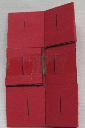
For Mama (said with the accent on the second syllable, of course), a couple more potholders.

potholders, front potholders, back

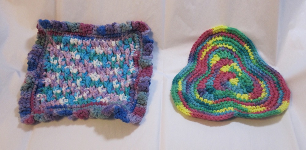
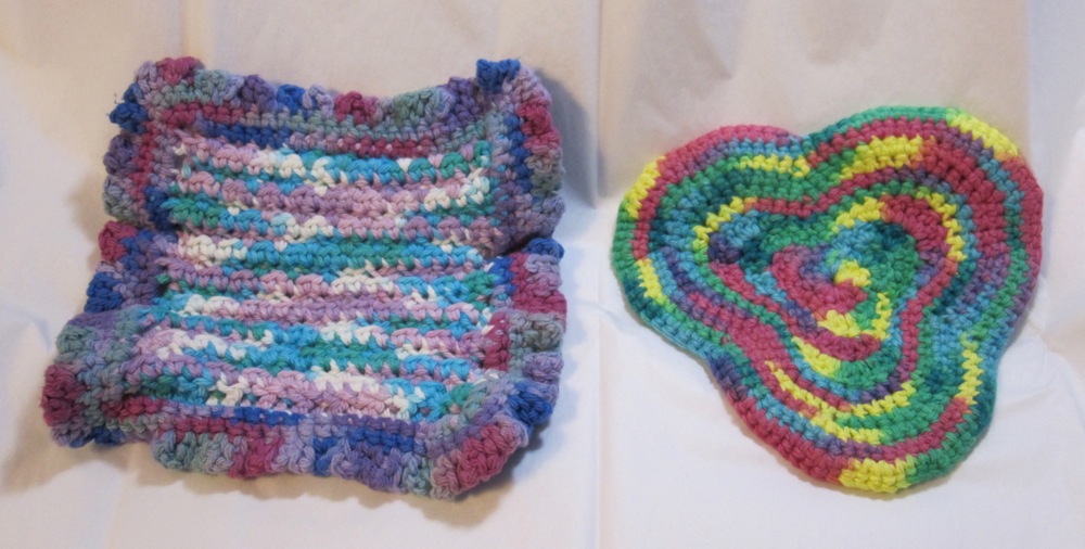
The triple-lobed one I freehanded, making the initial shape via stitch height and then continuing it by increasing around the lobes and decreasing (often via skipping a stitch) in the corners. The other is stitch pattern 421 from Linda Schapper’s Complete Book of Crochet Stitch Designs. It alternates double crochet with front post double crochet around a previous row’s double crochet, offset so you get a sort of checkerboard. Here’s a close-up:

stitch texture detail

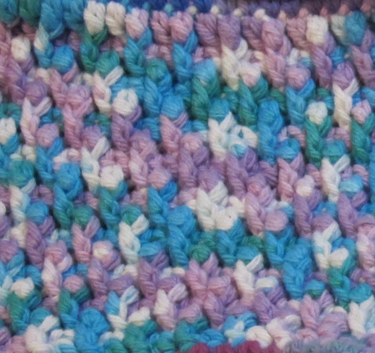
If I were doing it again I would change the outermost double crochets into half double crochet or even maybe single crochet, because the edges are taller than the middle with the pattern as written. I still like how it came out, though. I should have written down what I did around the edge, because I can’t remember. I think it was single crochet around and then double crochet with a chain in between each, but I wouldn’t swear to it.

For Grandmother, a fluffy white scarf with gold snowflakes, to wear with her stylish white dress coat. Here are a picture before washing and a snowflake close-up after washing:

before washing after washing

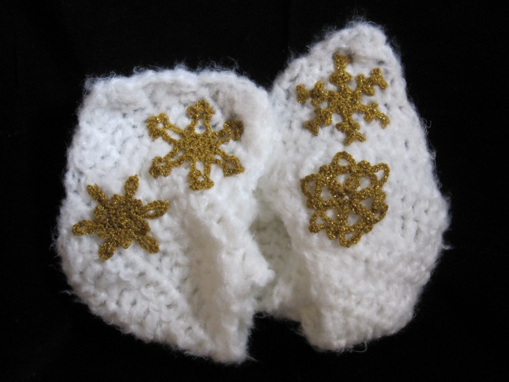
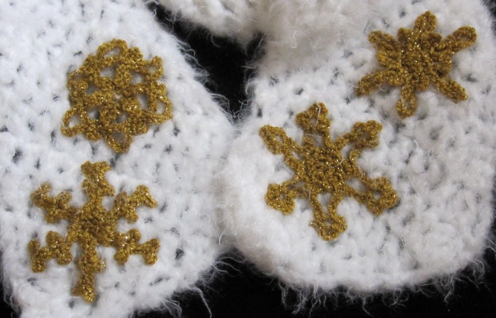
The diagonal stitch is just double crochet, increased at one end and decreased at the other. I ended up designing three more snowflakes at the last minute, which I haven’t had the chance to write up formally yet. I think my favorite is the one that looks a bit like antlers. After washing the fluffy white yarn was less fluffy, so I used my pet slicker brush to comb out the mats.

I also made my own chocolates, the easy way: three high quality chocolate chips in a candy cup, microwave in short intervals until soft, press a nut or two on top, add five or six more chocolate chips and repeat. Use the tip of a butter knife to get rid of the chip-shaped bumps once the chocolate is fully soft. You can make peanut butter cups as well, with one or two more chocolate chips on the bottom to give a sturdy layer. The disadvantage to this method is that cocoa butter soaks the candy cup and when it cools it is stuck to whatever it’s sitting on. I also made “mini turtles” with chocolate chips, half a caramel, and a broken-up pecan half, but if I were doing that again I’d cut the caramels (standard Kraft ones) into thirds and be more careful about getting chocolate between them and the cup on all sides – they stick! Those I did in the oven at about 200F, because I was worried enough time in the microwave to melt the caramel would scorch the chocolate.

More gifts will be revealed in later posts…

Historical recreation

Time for that middle-school-era “flexagon” I talked about. Because I recently learned how to make them, I present it in animated GIF form.

animated flexagon

To flex from one face to the next, you fold the long edges away from you and open down the middle. When 1 and 2 are showing, 1 will not open but 2 will reveal 3. When 2 and 3 are showing, 2 will open to 1 and 3 will open to 4. Finally, as you would expect, when 3 and 4 are showing 3 opens to 2 and 4 does not open.

Of course, after making lovely schematics for you, I remembered to do a search to try to find this. It’s a tetra-tetraflexagon, known since at least 1961. I think my instructions still add something, but I’ll put them under a cut.

Meanwhile, I made a new one without numbers. Unfolded it looked as follows:

front side, unfolded back side, unfolded

And here’s another animation!

animated flexagon

Continue reading Historical recreation

First Friday

Back despite a lack of popular demand! As you may recall, First Friday was a place where I wrote about something other than a project I was doing; links around the web and craft inspiration show up, as well as sneak peeks at my work. This month I want to talk about fonts and crafting.

There are an almost ridiculous number of free fonts available. Dingbat fonts seem to have limited practical use, but if you stop thinking of them as fonts and start thinking of them as clipart you can scale cleanly up and down indefinitely, without a vector graphics program, their horizons expand. For example, you could make a coloring book, or design your own embroidery patterns. An easy way to make embroidery patterns is to trim tracing paper down so it is slightly smaller than printer paper, tape it to a piece of printer paper at the leading edge (usually the top), and feed it through so the tracing paper gets printed on (usually loaded into the tray in with the tracing paper down). If you have larger solid areas of ink they take longer to dry on the tracing paper, but it is otherwise very easy. Taping it to a piece of printer paper ensures the tracing paper gets picked up properly by the printer, an idea I got from a tutorial about printing onto tissue paper to apply to candles.

Fontspace has a lot of fonts tagged with keywords, and as a bonus, a filter option to show only those fonts licensed for commercial use (it even tells you how many you’re missing out on with the filter on). If you want to sell what you make or just cover your bases for all potential later decisions, stick to commercial use fonts (of course this does not give you license to sell the font itself, just the things you create using it). Here are some designers and particular fonts I found browsing Fontspace recently.

  • I drooled over Dieter Steffmann’s calligraphic, Art Deco, Art Nouveau, and other historical-looking fonts for quite some time. He also has some fun ones, like Typographer’s Holidayfont, a multi-holiday collection of dingbats, and Drift Wood, letters drawn as though made out of rough boards that have been nailed together. All of them are wonderful and gave me no warnings in Font Book (a rarity in the free font world).
  • West Wind Fonts has a lot of dingbat fonts available for commercial use. I love Kitchen Kapers, a font of outline letters with kitchen-related images (that match the letter). It would be perfect for a child’s coloring book but for the fact that X’s picture is butter melting onto popcorn – and the only guess I’ve seen for what that means is X-rated movie! You could mix and match with AlphaPikture ‘Bet by Nght’s Place, which punts on the vowels but does a good job with the consonants. It is also an outline font with pictures, good for coloring.
  • I noticed dustBUST because of Invaders, all the beautiful pixellated Space Invaders graphics. It would be fun to make a cross-stitch pattern with. (Of course you could go with a font that is already cross-stitch, such as Goodbye Crewel World – note I don’t know about the commercial use status of that font.) I also quite like Dreamland, though maybe not so much for embroidery.
  • Another designer with a LOT of fonts is GemFonts. A small selection: Multicasion, a holiday dingbat font, Culinary Art, a food dingbat font, and Fantasy Clipart, a collection of highly detailed illustrations of mythical creatures, treasure, and adventure.
  • Getting back to decorated letters, Xmas Alpha and Holly are both Christmasy, the former outlined capitals with Christmas-related images (unrelated to the letter), and the latter a decorative font in which part of every character has been replaced with a holly leaf (or in the case of some punctuation, made to look like a holly berry). The kerning is not good in the holly font – some letters overlap and some have big gaps – but you could fix that in the design process. A lovely non-holiday decorated font is LSLeaves.
  • Back in the realm of children’s alphabet coloring books is Alfabilder by Peter Wiegel. This is a dingbat font (pictures only) where the name of the object in German starts with the corresponding letter. There is nothing that starts with Q in English, and there may be other letters missing, but many objects have the same initial in English as German and others can be rearranged. I realized upon looking at it a second time that many if not most of Nina’s Animals match their letters, though there are some glaring exceptions (some of which could be rearranged – for example, v is a snail, but b looks like a vulture). It is very cute, though; check out the rest of GorillaBlu’s fonts.
  • So as not to go on too long, I’ll close with two more designers. Blue Vinyl gives us Lucky Charms (the superstitious kind rather than the cereal), Sugar Coma (worth it for the gumball machine at R/r alone), and Trick or Treat BV (a wide variety of Halloween images). Intellecta Design has a lot of complex dingbat fonts, such as Random Dingbats (includes a lovely turkey, phonographs, old-fashioned silhouettes, a UFO, and much more), Zooland (lovely animals as though out of a children’s book, many holding blank signs), and Barber Poles (the font you never knew you needed).

As this posts I am at an open house at the Sew-Op, trying to drum up some more teachers and students and workshop users. Happy December!