 A recent thread on Ravelry about pattern pricing made me wonder whether I’d ever written here about the decisions I made along the way to opening my pattern store. A little looking says no, I haven’t, so here we are. I think it may be of interest both to people considering buying from me and people considering selling their own patterns. Pricing is at the bottom, since I decided it last, in case you want to just hop straight down there.
Getting Started
Before making my first PDF, I read about page layout and graphic design; The Non-Designer’s Design and Type Books taught me a lot of fundamentals at large and small scales, and various sites online chimed in about grids for page layout, style guides, and branding (I still have yet to crack open Brand Against the Machine, though, and Amazon tells me I bought it two years ago).
As part of branding I chose colors (“Stumpy Green”, a pale blue, and originally “Hugs White” but that was replaced with true white), developed my logo (which took a long time, and then a quick inspiration, and then another long time), and chose fonts: Janda Elegant Handwriting for my logo and Rotis Semi-Serif for my pattern text (you can also see it in the header image on this blog). Overkill perhaps, but I wanted all the pieces in place as though I were a huge company, because then they will all just be there as I proceed.
I also needed an appropriate program. As a former mathematician, I first turned to LaTeX, but I simply couldn’t get it to easily do what I wanted in this case. I like open source as a philosophy and also wanted to minimize my start-up costs, and the combination led me to Scribus, a desktop publishing program. More on all the software I use has already appeared here; I’ll just mention that it took me some time to discover the existence of WooCommerce. I actually found it by reading 1-star reviews of a different WordPress e-commerce plugin, where someone said they wished they could have a do-over and use WooCommerce instead.
Layout and Style
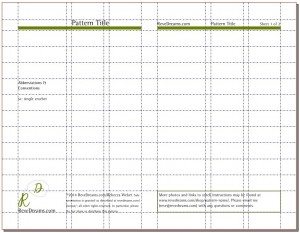
At this point I had some ideas about good page design, wanted a grid for consistency with flexibility, and wanted a style guide for additional consistency. I also realized that the standard portrait-oriented full sheet of paper could be improved upon (in my obviously not-so-humble opinion) for sitting in a chair and stitching. My patterns are on landscape-oriented paper split into two portrait-oriented halves. They will spread across a lap or can be folded in half and set on one leg or on the arm of a chair.
A lot of work I’ve mostly forgotten went into setting up a Scribus template. First I did a lot of arithmetic; I wanted square photos to fit neatly, not just horizontally but also vertically. Scribus allows you to align your lines of text to a baseline grid, which has adjustable distance between lines (baseline skip) and offset from the top of the page. I worked with the baseline skip as my unit of measurement, so all of my column widths are multiples of that, the gutter between the columns is one baseline skip, and the center margin is three. My grid system is one larger and two smaller columns in each half of the page, with some horizontal guides as well for aligning images. The columns can be combined into two or even one larger column (which they typically are; I’m not sure I have a single pattern that uses them all separately).
The first half of the first page always has the title, main photo, description, materials list, stitch abbreviations and conventions, and logo. It usually has the copyright statement as well, but that can be shifted around if it helps pattern readability. Somewhere else in the pattern is a boxed paragraphs pointing the stitcher to the pattern page for additional photos and stitch instructions. The very top is the same on each sheet: green bars across the top with the pattern name, ReveDreams.com, and “Sheet X of Y” (fortunately Scribus can fill in the appropriate numbers automatically, so I don’t have to tweak this).
As for style, essentially I tried to be very consistent when I made my first five patterns, recorded all the details, and have been (mostly) abiding by and extending that style guide ever since. It covers capitalization, hyphenation, bolding, indentation, punctuation, crochet instruction conventions, and perhaps most importantly, what all I want to include in every pattern. It also has my Scribus page layout information in case I should ever lose it.
Pricing
Now we’re at the last major hurdle. How to price? I first went around to look at some of the major amigurumi designers’ prices, so mine would be in line with the market. They range from $7 down to $2, essentially, and I went through a number of schemes for my own patterns. Price based on whether the pattern makes one item or two? Price based on size of finished item? Price based on difficulty? Finally, during one of our long car trips to visit my family, I thought of pricing based on the length of the PDF. That way, patterns that are more complicated or make larger items automatically have higher prices than patterns that make simpler, more repetitious, or smaller items. It doesn’t necessarily reflect the amount of effort it took for me to develop the pattern, but it’s at least correlated.
I make my patterns self-contained for the intermediate crocheter, with additional material for beginners accessible from the pattern page in the shop, and I am as concise as possible without sacrificing clarity. My actual pricing formula, heretofore unrevealed, is $1 plus $2 per sheet of paper, calculated to the half-sheet. That’s actually a little flexible; I think of my educational materials as $1 per sheet, though all of them are name-your-price, and sometimes that slips in to lower a price that strikes me as a little high.
All decisions (well, almost all) about pricing are taken away, and hence also stress about decisions about pricing. It would be easy to change should I decide inflation has raised the fair price of a pattern, and meanwhile is in line with the market average: my fixed-price patterns are between $3 and $6, with an average of exactly $4.50.
I think that’s all the major decisions that had to be made. I’m very comfortable with my system; it is still time consuming to get a pattern from brain to store, but having a template makes it a lot easier.
